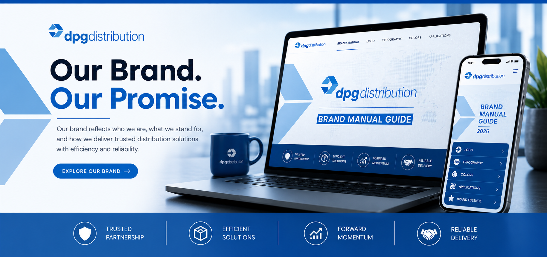
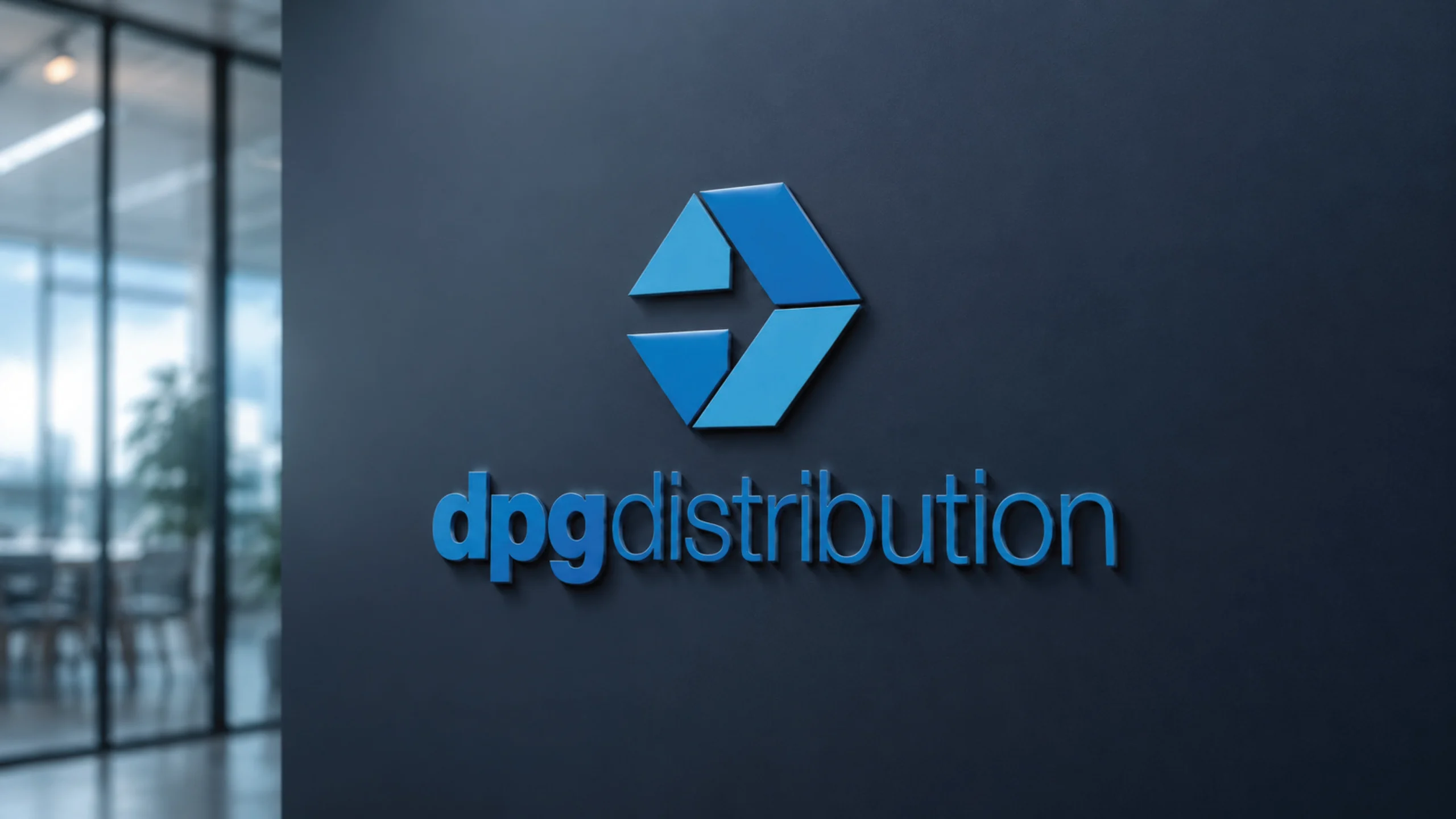
The DPG Distribution Brand Book serves as the definitive visual and communicative blueprint for the company’s identity, anchoring its presence around the core principles of connectivity, efficiency, and forward momentum. At the heart of this strategy is a modern geometric logo constructed from a balanced hexagonal composition. Its clean, angular forms and negative space symbolize a seamless logistical flow and a dependable distribution network, while its lowercase, minimalist typography presents an approachable yet professional modern aesthetic. The visual identity relies heavily on a primary color palette featuring a vibrant, trustworthy blue (PANTONE 7461 PC) paired with a sophisticated charcoal and balanced light blue, a combination designed to communicate innovation, partnership, and reliability.
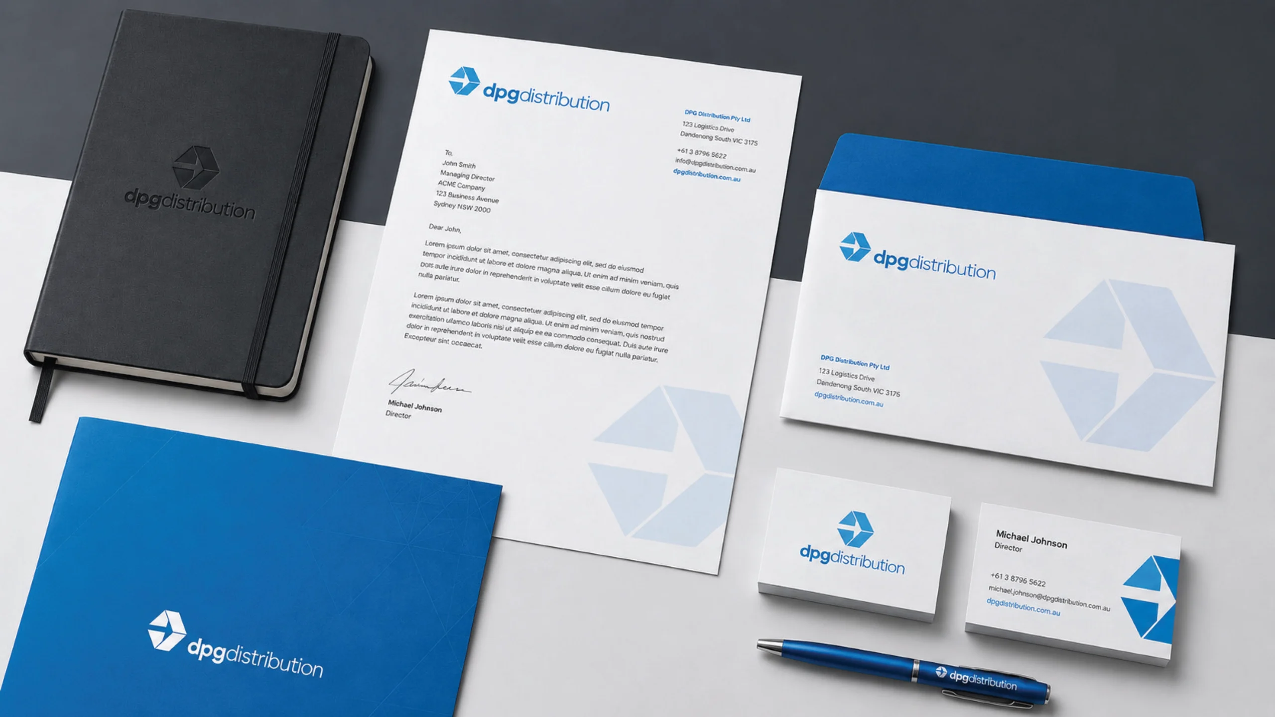
To ensure consistency across all touchpoints, the manual outlines strict execution guidelines spanning multiple mediums. It mandates specific typographic hierarchies—utilizing Inter for primary headings and Poppins for subheadings and body text—alongside exact clear-space rules to preserve logo legibility. The comprehensive framework also provides standardized templates for daily operations and corporate outreach, including cohesive stationary designs (letterheads, business cards, and envelopes), digital UI kits featuring standardized component spacing, and dedicated layouts for presentations and social media platforms. By unifying these diverse visual elements, the brand book guarantees that every corporate communication reinforces DPG Distribution’s commitment to delivering high-quality, efficient supply chain solutions.
(Click Link) Download the DPG Distribution Brand Book